

Tutorials > CSS > Dynamic Containers
Create jaw-dropping visual containers for your site's content that expand dynamically with content.
If the images on this page do not appear, click here.
In this article I will demonstrate how to create jaw-dropping visual containers for your site's content, which expand dynamically depending on the amount of content within. As a bonus, minimal code is used and there is not a table cell in sight.
Introduction
We are going to use CSS to achieve this. Because we are using CSS to set all images in the container, the images will only be downloaded once - this cuts down on bandwidth and load time. First, let's take a look at the HTML code our content uses at the moment.
<h2>Heading</h2>

<h3>Subheading</h3>
<p>Lorem ipsum dolor sit amet, consectetuer adipiscing elit.
Etiam lectus pede, lobortis sed, pulvinar vel, blandit eu,
arcu. Nullam facilisis varius lacus. Aenean orci. Morbi
imperdiet fermentum enim. Morbi tincidunt tortor sit amet
ipsum.</p>

<h3>Subheading</h3>
<p>Donec rhoncus. Nam faucibus ornare eros. Suspendisse
lectus. Quisque mollis erat volutpat risus. Cras in tellus
vitae elit tristique laoreet.</p>
Creating Images
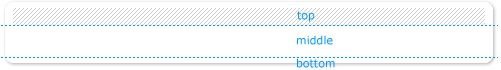
We are going to need three images. These are the top, bottom and middle images. For the purposes of this article I have created a container with a pretty dropshadow border and patterned top. Feel free to make yours however you wish, but keep in mind the next step.

Now we need to cut this into three parts. Select the following three parts and save them respectively as top, bottom and middle in whichever format works best for you. In Photoshop I tend to use Save for Web with Gif 128 Dithered. Bear in mind that when saving the middle image it normall only needs to be 1px high.
Updating the Code
Now we need to work out where to place these images. Our heading can already accomodate the top image, so we need two containers for the middle and bottom images.
<h2>Heading</h2>
<div class="container">

<h3>Subheading</h3>
<p>Lorem ipsum dolor sit amet, consectetuer adipiscing elit.
Etiam lectus pede, lobortis sed, pulvinar vel, blandit eu,
arcu. Nullam facilisis varius lacus. Aenean orci. Morbi
imperdiet fermentum enim. Morbi tincidunt tortor sit amet
ipsum.</p>

<h3>Subheading</h3>
<p>Donec rhoncus. Nam faucibus ornare eros. Suspendisse
lectus. Quisque mollis erat volutpat risus. Cras in tellus
vitae elit tristique laoreet.</p>

<div class="footer"></div>
</div>
This makes no change to the appearance of the page. Now all we need to do is create the CSS code for this. Open up your stylesheet.


